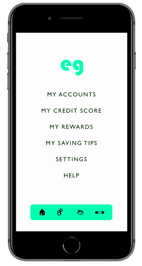
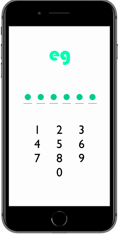
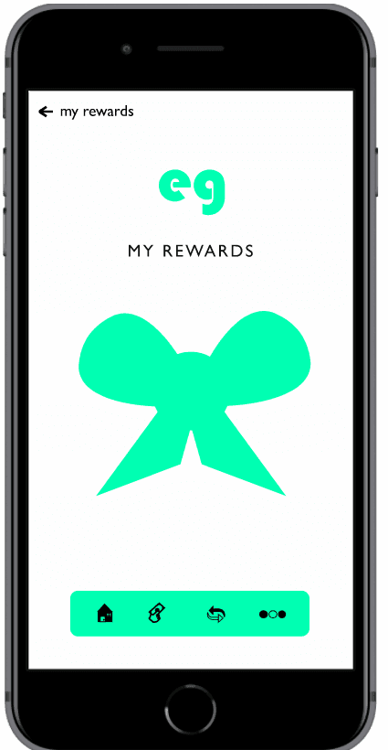
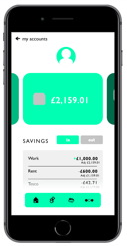
I very happy with how it turned out. I really liked playing with the bright green to see how it would look.


If I were to do it again i would make the nav bar a bit bigger and the icons bigger so you can see what each one is.


I would also change my back arrow to a simple < so it ties in with the style of my app.


© Ellie McKay 2022

Evergreen App

Evergreen Colour Palette

Evergreen Colour Palette

I originally went for a natural font style for my bank as it reflected the evergreen name- trustworthy and nothing fabricated.

However, I ended up exploring more industrial-looking fonts. I decided on one called Bauhaus 93 because it was bold and strong to represent the roots of the bank and the curve of the letters as it brings a softness to the look of the brand.


This gentle side of the logo represents the caring nature of the brand to its customers.

I originally went for a natural font style for my bank as it reflected the evergreen name- trustworthy and nothing fabricated.


However, I ended up exploring more industrial-looking fonts. I decided on one called Bauhaus 93 because it was bold and strong to represent the roots of the bank and the curve of the letters as it brings a softness to the look of the brand.


This gentle side of the logo represents the caring nature of the brand to its customers.

I was tasked with designing a banking app for students. I began with designing the logomark for my bank

I was tasked with designing a banking app for students. I began with designing the logomark for my bank.